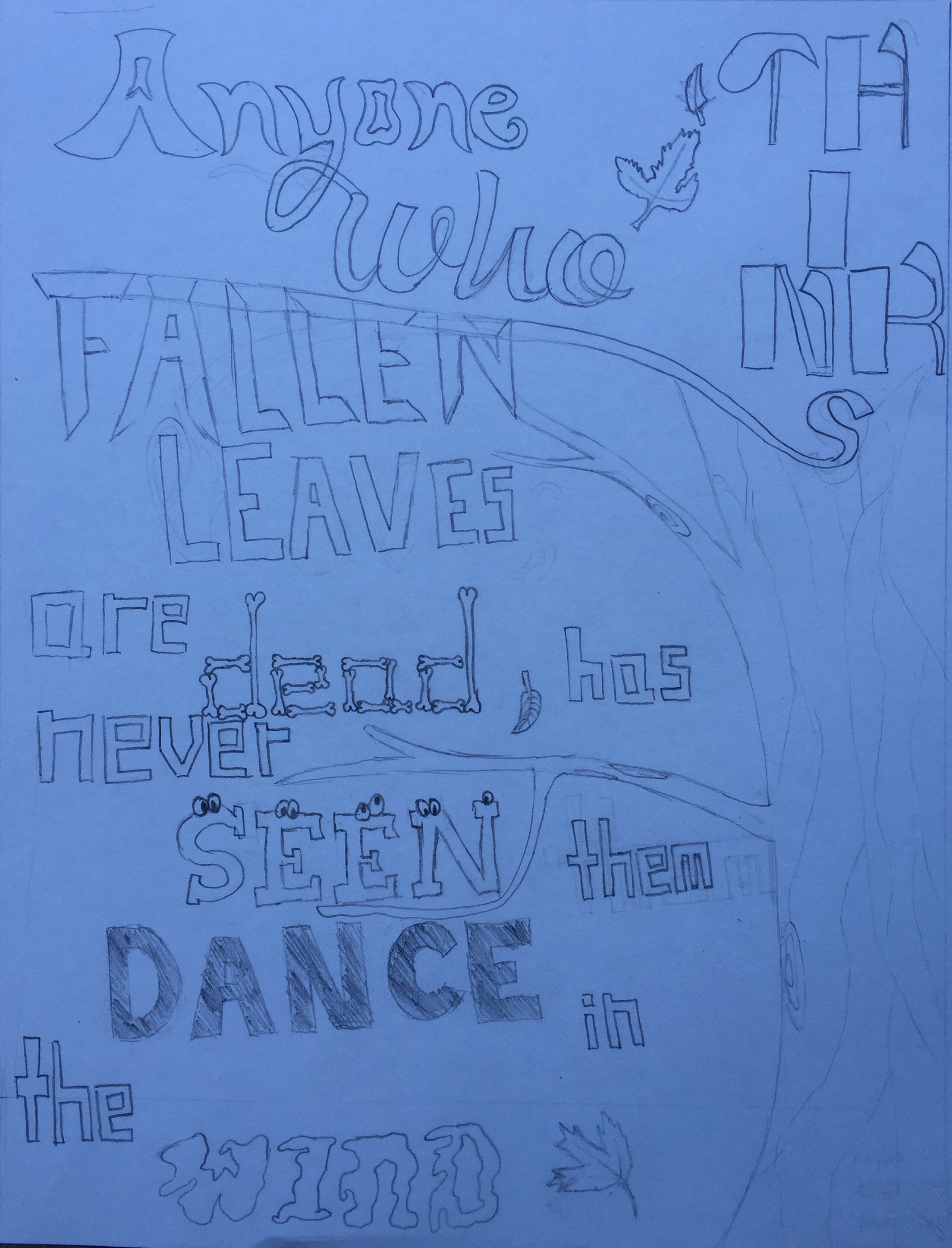
 I found this quote online after being inspired by watching the leaves fly in the wind. I find this quote very interesting and very true. Sometimes one may think called leaves are dead, but when wind comes, these leaves start flying in the air, seemingly dancing. In my artwork, I tried to repeat the format of the fonts. I used a square font design for the words that do not have as much meaning, but for words such as "dead", "seen, and "wind", I tried to incorporate the literal meanings into the font styles. I used bones to symbolize dead, eyes to symbolize seen, and irregular shaped don't to symbolize the effect of wind. Through the process of creating this artwork, I learned how to better illustrate meanings of the words through the font designs. I also learned how to use repetitions in fonts and illustrations to uniform some aspects of the design. However, there are many areas I can improve in. One of the most important improvements I can make is use more repetitions in my design. I think using fewer font styles may benefit my artwork by making it more simplistic and appealing to eyes. Overall I think it is a good design that can be understood without reading the quote, but I can make some adjustemnts to make it more visually appealing.
For this hand lettering project, my poster is inspired by a fantasy football name. First, I decided to use a font similar to Instagram for "InstaGraham". I also decided to include a football shape in the middle while placing the letters along the curve. The outside frame and the line in the middle are the lines that appear on a football field. I tried to have the colour of the poster match the colour of an actual football and football field, thus the poster is mainly green with a brown football in the centre. This project helped me practice my cursive writing as well. One of my favourite part of this is the connection of the "g" and "m" in "graham". Furthermore, through this project, I learned how to better organize elements with a limited space.
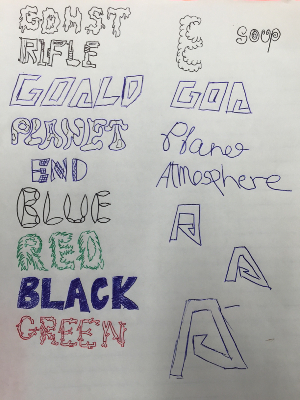 These fonts are inspired by many different sources. Some of them are futuristic and others are inspired by real life objects. The green is inspired by tree branches, rifle is inspired by guns, gohst is inspired by the look of ghosts or the melting candle. This entire process of sketching words helped me to get more creative and explore all the different fonts possible with hand lettering,
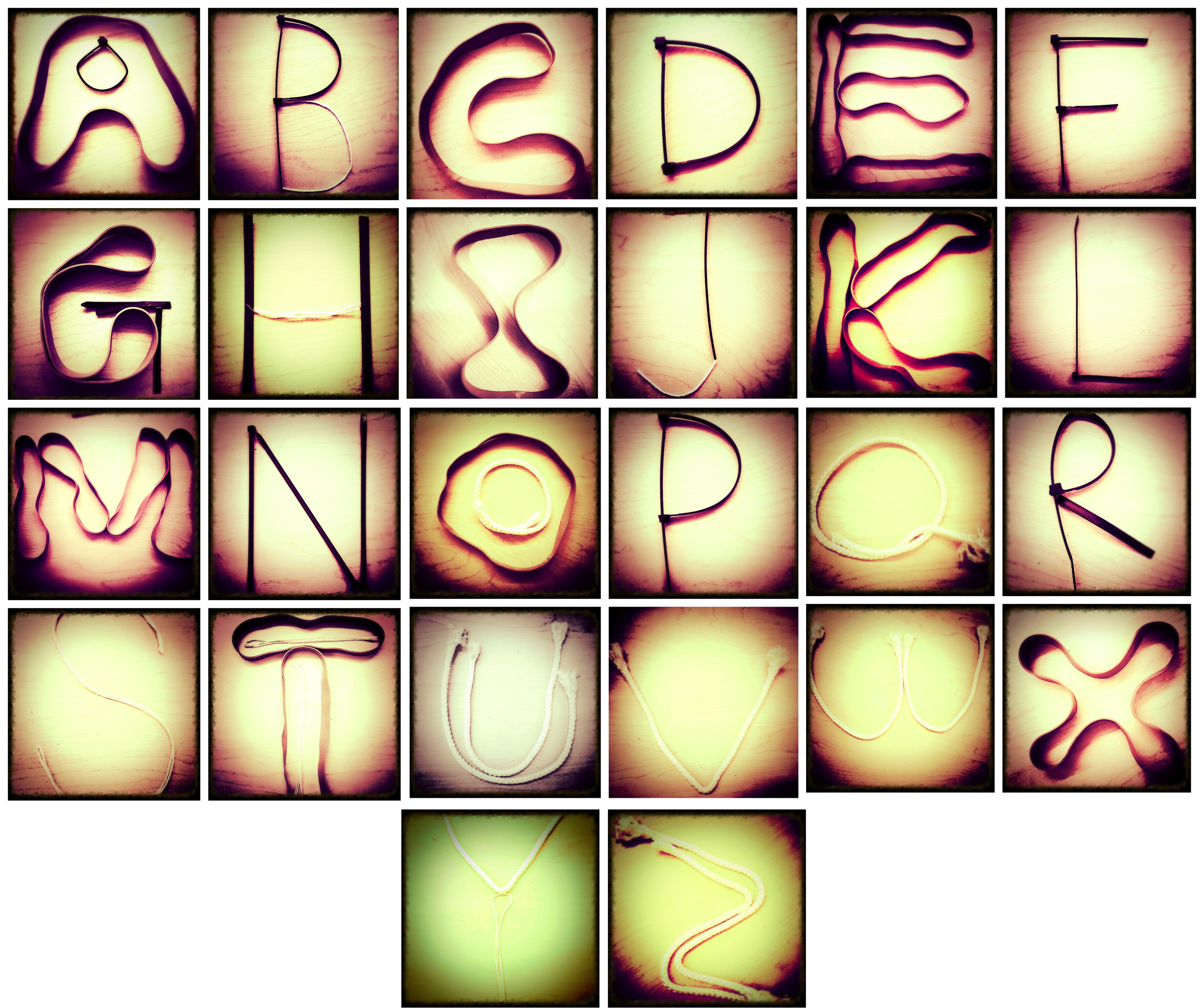 I made the letters with rubber bands, zip ties, strings and ropes. Trying to create letters with rubber bands is extremely challenging especially with letters that have edges and corners, such as "Z", "M", "A", and "E". In the end we decided to alternate between rubber bands and zip ties for the letters. I love using letters that are hollow, that inspired me to use rubber bands as outlines and leave the centre hollow.
|
Write something about yourself. No need to be fancy, just an overview. Archives
November 2015
Categories |
 RSS Feed
